top of page

One of our latest illustrations for Oxford University Press was a charming English village, designed to help language learners master prepositions of place such as "next to, in front of, across from, opposite", etc.


One of the things I like most when we do illustrations for books is to use very positive colors looking for a balance so that the illustration is not saturated but provides a point of color for the student to break with the monotony of the classes and identify all the concepts while having fun in every detail.


If your company needs illustrations or animations to make your content more captivating and engaging, we can talk about your project and later provide you with a plan of action.


Colorful illustration of a small English town featuring a roundabout, a church, houses of different styles and colors, a statue of a man on horseback, and people walking. The scene includes a bridge over a river with boats and ducks, a tunnel with cars entering and exiting, and trees in the background. The sign reads 'Newton 4,' indicating the next town's name.


Here you have 5 more iconic buildings from Paris we made for "Reporters francophones 2" the brand new French language learning book from Éditions Maison des Langues.


Every illustrated landmark was just 2 x 2 cm and placed on a Paris map, and as always, reinterpreting buildings is one of the tasks that I love the most.


Always grateful to Virginie Karniewicz, Beatrice Biella, and Lucie Hodierne to give me once more all the creative freedom to create a beautiful set of illustrations for this new volume.

Flat vector illustration of Arc de Triomphe.

Flat vector illustration of Le Musée d'Orsay

Flat vector illustration of Tour Eiffel.

Flat vector illustration of Théatre du Châtelet.

Flat vector illustration of Gare de Lyon.

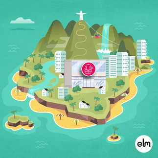
One of my favorite projects we delivered for ELM Learning was an illustrated game map for one of the best high-end fashion companies in the US based in (the 5th Avenue of) New York.


Many times we take care of a project from the beginning till the very end, but in some others, we have to use some previous assets and create new ones always trying to leave a mark.


In this case, we had the core buildings (the ones with the magenta icon) and we had to create a map in which every lesson was an island that represented a region or country of the world.


One of the key points of this project was working with Rebecca Irby, one of the best creative directors I have had the chance to work with. She gave me tips on the brand style guide, references, style, and creative freedom to get this map done and dozens of other assets in record time.


Illustrated map for a game for a fashion company.


  • Black Instagram Icon
  • Icono negro LinkedIn

© 2025 - Alejandro Milà

All rights reserved

​

bottom of page