top of page

I love minimalism...


But people play it so safe that a coffee shop in Thailand ends up looking exactly like one in Oslo, which looks just like one in Brooklyn. Roads are full of monochrome cars with nearly identical designs, and fashion ditched the colors of the 50s; now everyone’s wearing black and classic blue jeans.


Aesthetics come and go in cycles, sure, but over the last 20 years, the world has standardized itself for efficiency and mass sales.


In the end, when everyone does the same thing, your product gets lost in an ocean of visual uniformity.


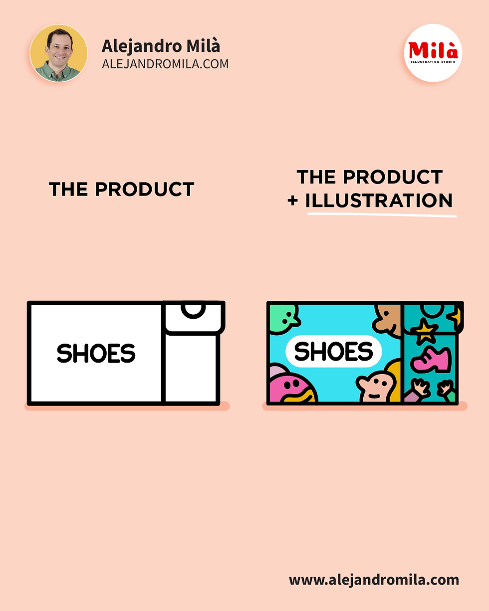
Illustrators don’t just fill a product with color and characters.


We dive deep into the brand and bring different solutions.


Our cultural background slips in and sparks conversation.


In short, we break the monotony.


Need illustrations to make your product stand out?

DM me or email: alejandromila@yahoo.es — let’s make your project unforgettable.


❤️

Comparison graphic by Alejandro Milà: left side shows a plain product label/box simply saying 'SHOES' with a white background; right side transforms it into a vibrant, fun illustrated shoe box covered in cute, colorful monsters, little creatures, stars, and playful doodles surrounding the word 'SHOES'. Titles 'THE PRODUCT' vs 'THE PRODUCT + ILLUSTRATION' on peach background. Studio branding and alejandromila.com included.

Why Your Product Needs Illustration


Over the past two years, I've collaborated with ELM Learning to create dozens of courses for Shopify, a leading online store platform. While I could share hundreds of illustrations highlighting the platform’s features, I’d like to spotlight the conceptual header illustrations we designed for each course.


The challenges we faced included:

· Condensing each lesson’s theme into a single, impactful visual.

· Creating white illustrations with a 1pt black line on black backgrounds.

· Using only frontal-view assets, without shadows, volume, or perspective.

· Delivering unique headers that not only explained but also inspired students.


Here’s what we achieved:

· Starting with 5 courses, we ultimately created over 50 engaging courses.

· Followed strict brand standards for balanced, cohesive visuals.

· Delivered over 400 captivating and creative headers.

· The client LOVED our conceptual illustration style.


These are just a few examples, and I’ll share more in the coming days. I’m incredibly proud of our work on this massive project and grateful for ELM’s trust in my expertise over the years.

Illustrations for Shopify e-learning courses by Alejandro Milà


One of our latest illustrations for Oxford University Press was a charming English village, designed to help language learners master prepositions of place such as "next to, in front of, across from, opposite", etc.


One of the things I like most when we do illustrations for books is to use very positive colors looking for a balance so that the illustration is not saturated but provides a point of color for the student to break with the monotony of the classes and identify all the concepts while having fun in every detail.


If your company needs illustrations or animations to make your content more captivating and engaging, we can talk about your project and later provide you with a plan of action.


Colorful illustration of a small English town featuring a roundabout, a church, houses of different styles and colors, a statue of a man on horseback, and people walking. The scene includes a bridge over a river with boats and ducks, a tunnel with cars entering and exiting, and trees in the background. The sign reads 'Newton 4,' indicating the next town's name.


Ready to bring your project to life?
Fill out our form or drop us an email and let's start working together.

  • Black Instagram Icon
  • Icono negro LinkedIn

© 2026 - Alejandro Milà

All rights reserved

Milà Animation Studio logo
bottom of page